Showing posts with label how-to. Show all posts

Sunday, March 12, 2017

It's a Poser, all right.

My site stats say several people have accessed the old posts on rigging for Poser (the 3d figure-centric animation and rendering software). So here's the long-delayed third post in the series.

Since I haven't used Poser in a while this is going to have less in the way of concrete examples. Also, the last version I used was 9 and it is up to 11 now. Poser tends to maintain backwards compatibility with previous tricks, though, even as it adds new ones (each generation of figures adds some new tricky way to deal with the perennial core problems like poke-through -- and let's not even get into DAZStudio which, while maintaining a large degree of compatibility with Poser-generated content, changes many of the paradigms).

So I will try to give examples, but, really, the best way to do this is to find a Poser file and reverse-engineer it. See how the stuff is actually formatted. Or go look online for one of the various useful guides. Once you know what is possible and what people tend to call it, it is a lot easier to find help on getting it right.

So  to it. The three Poser power tools I find the most useful for the Poser content I've created over the years are, in no particular order, altGeom, ERC, and MAT poses.


altGeom: 


Overview:


Way back in the early days of Poser, either the riggers, the software, or the projected customer base couldn't handle the idea of rigging every finger. So they created a way to swap out one pre-posed hand with another. The code was still in there when the first Millenial Figures arrived (the original Victoria 1 and Michael 1), and stayed in the code as the vestigial gen/noGen switch (aka, a way to change out the lower-torso mesh to one with or without the naughty bits).

altGeom is a handy way to change the shape of an item past what morphs allow you to do. Let me review for a moment; a morph is a list of deltas -- differences in position -- for the vertices already in the mesh. Applying a morph causes each vertice in the original mesh to move to a new position. Which is why you can dial in a morph as a percentage, including applying it extra strength or negatively -- in the latter, the vertices simply move in the opposite direction.


It is hard to see in that tiny video but the spring on the kick pedal here is using a morph to elongate. There are also morphs on the head of the drum so it "dimples" when hit.

 For the stage microphone set I made, every stand was equipped with an altGeom dial that provisioned it with either a standard mic clip, a large shock mount, or a null object (no clip at all).

Construction:


An altGeom consists of two things; a geometry reference to the different geometry, and the code to create the dial (which is subtly different from that used in a translate or morph dial).

Again to review; in all Poser figures and most props, you will find two pointers; the figure reference file, and the actor pointer. They look like this:

figureResFile :Runtime:Geometries:Princess:Stage_Mics:shortStand.obj


and

actor clipBase:8
{
storageOffset 0 0 0
geomHandlerGeom 13 clipBase 

The name you see there, "clipBase," needs to appear as a geometry group within the geometry file "shortStand.obj" The actual actor name, however, does not need to match; the geomHandlerGeom reference is the only place in Poser where it needs to see the actual name in the geometry file.

So...unlike everywhere else in the Poser universe, in a part with an altGeom there is an additional figure reference occurring inside the body of the actor;

alternateGeom    clipBase_2
{
name clipBase2
objFile 2101 :Runtime:Geometries:Princess:Stage_Mics:clipBaseALT.obj
}
defaultGeomName  clipBase_1

This is, of course, the actor in which occurs the actual dial for the altGeom. Take note of the "2101" there; this is a unique identifier that must be different from any other geometry used in the Poser scene. Starting above 1000 is strongly recommended.

And here is what the actual dial looks like:

geomChan handGeom
{
uniqueInterp
name change clip
initValue 0
hidden 1
forceLimits 1
min 0
max 2
trackingScale 0.045
keys
{
static  0
k  0  0
}
interpStyleLocked 1
valueOpDeltaAdd
Figure 8
clip:8
changeClip
deltaAddDelta 1.000000
valueOpDeltaAdd
Figure 8
BODY:8
changeClip
deltaAddDelta 1.000000
}

Something to note here; the limits are set to the number of actual geometries being referenced (including the original). "handGeom" must be used as the internal name for Poser to understand the unique nature of this dial, but the external, user-facing name can of course be of your choice.

Wrap-Up:

So -- a few other useful things here. The source file can contain other groups, and multiple figures can access the same alternate geometry. You can access the same group multiple times, too; I coded up but never got around to releasing a Climbing Wall where each potential hold was an actor containing the translate instructions to move the geometry into the right location on the wall. Thus, there was only one of each hold ever constructed; the cr2 did all the work of populating the wall. And, of course, the end user could set a new route merely by rotating a few dials.

Unlike morphs, the altGeom does not need to share the number or winding order of vertices. However, if the edges are nearly identical, Poser will still manage to weld the meshes together when it makes a figure. Also, of course, the morphs for one geometry won't work on the other. But, strangely, Poser will sometimes recognize this and will hide the dials belonging to one geometry and show dials you've created for the alternate geometry. This can not, however, be always trusted.

Alternatives: Instead of using an altGeom, some props are simpler to build by hiding the optional bits using the ability to hide (and not render) a specific actor. As far as I know you can't build a "show/hide" dial, but you can construct a one-click pose to do it. Similarly, translate and/or scaling could be used in an ERC dial to hide one optional bit and show a different one instead.


ERC:

Overview:


When Poser finally got around to adding fingers, they realized folding all of them individually to make a first was a pita. So they added a bit of code which is still in there; name your fingers with the same internal names as those on a standard Poser figure, and create a dial called "grasp," and they will all respond to it.


It actually worked on this cute guy, here, even though he only has two fingers on each hand! Well, this same trick was later leveraged in by the Poser designers to allow all the body shape morphs to be collected together in a single spot instead of having to go to every limb and digit turning dials individually.

In any case, it didn't take long for the community of Poser tinkerers to realize that this lowly bit of code had untapped powers. In essentials. and with some important exceptions, every dial in Poser can be slaved to another dial.

This is...absurd. Some users attempted to make sense of this cornucopia by coining the terms "JCM" for morphs that automatically dialed themselves in when a joint was moved (aka, bend the elbow on a Poser figure and the biceps muscle swells in a natural way), "JCT," "FBM" (Full Body Morphs, meaning a single dial will tweak in separate "muscular" morphs across multiple body parts), Super-Conforming, etc. But in general the blanket term "ERC" (for Extended Remote Control) is accepted.


Superconforming:


One of the uses to which ERC has been put is to allow clothing to magically take on the same morphs being applied to the figure below. The trouble with this happy picture being crosstalk. A simple search will turn up thousands of systems for fixing the crosstalk problem. They are all wrong. Simply put, Poser creates instancing on the fly as figures are added to the workspace, or as a scene file is read in. It is entirely impossible to force Poser to observe unique identifiers (outside of, perhaps, manipulating the Poser workspace in a more direct way using Poser Python tools).

So you can get superconforming or crosstalk to work for you once, say when creating a scene, but save it and restore, add something new, or even work on it too long and the references will be lost.

Poser is dumb. It looks in the first place it thinks of to find anything, from the matching master dial for an ERC slave code to the correct texture file. And it doesn't always start where you would expect or want it to start. Which means that even internal ERC channels can get "lost" and wander off when you have more than one figure in the scene.

That said, operating ERC between figures is an alarmingly powerful too with all sorts of wonderful potential.

Construction:


An ERC chain consists of three things; a slave dial, a target dial, and the code within the slave dial setting how it is to respond.

The master dial can be any kind of dial; a morph dial, a translate dial...or an empty dial. The code for creating a dial that doesn't do anything itself is as follows:

valueParm turnClip
{
name turn clip
initValue 0
hidden 0
forceLimits 1
min -360
max 360
trackingScale 0.2
keys
{
static  0
k  0  0
}
interpStyleLocked 0
}

The usual dial functions are here; internal name versus displayed name, the ability to hide the dial, and, yes, dials can be stacked (just don't point them at each other. Quickest way to crash Poser that has yet been discovered).

The code that makes the magic happen is all in the slave dial:

rotateZ zrot
{
name tilt clip
initValue 0
hidden 0
forceLimits 0
min -90
max 100
trackingScale 1
keys
{
static  0
k  0  0
}
interpStyleLocked 0
valueOpDeltaAdd
Figure 8
BODY:8
tiltClip
deltaAddDelta 1.000000
}

The key is in those last four lines. The source figure is, as I said, bollixed in by Poser when you load the figure. But you can at least try to push it in the right direction by making it match the actor numbers of the figure file. The next is the actor that contains the master dial, and the penultimate is the internal name of that dial. The last is the tracking scale.

Setting the tracking right is often key to getting ERC working right. For a full body morph, the tracking is usually 1=1; each body part morph dials up to the same amount. For trying a morph to a joint rotation, though, you need to know that Poser uses 1.0 as meaning a morph is full-on, but a rotation around a full circle appears in the Poser code as "360."

So, yes; one of the most useful functions of this is to take dials that might be spread all over the figure and mirror them in a place where they are easy to find. Incidentally, another Poser peccadillo it is doesn't always save channels in the BODY when the file is saved and retrieved. It is safer to consolidate your master dials in the top selected body part instead.

But since you can merge and stack dials, there's some fun tricks you can do:


Again, sorry for the poor render here. These are actually copies from stuff I uploaded to YouTube years ago. So there's some simple things here; the turning sense head on the ghost detector is linked to a morph that extends the loop of wire connected to it. The jaws of the steam powered monkey wrench automatically spin the nut as they are opened.

A little more tricky, the gear box is set to a single dial (and all the individual gears are hidden in the cr2, meaning they display in the workspace and render but don't show up as selectable body parts), and each uses a deltaAddDelta tuned to its diameter so the teeth mesh.

The trickiest is the steampunk sonic screwdriver (which is unfortunately impossible to see clearly in the render). The trick here is joint limits are set on the joints, dial limits on the dials, and in some cases a dial is set to a negative number below the joint limit. So what happens is that dial waits until the master dial has rolled it over into positive numbers again.

Under a single master dial, the spinner makes a half-turn as it starts to retract. The spring collapses with it. When it has fully retracted it stops; the leafs, which have been waiting quietly the whole time, close over it.

People have used this sort of trick...multiple stacks of dials pointing at each other, phantom dials that are hidden from the user and exist only to delay a following action... to rig tank treads.

As one extended example of ERC in action, the Easy-Pose cables or tentacles use ERC to make a long flexible object possible. The figure has an otherwise uncontrollable number of body segments, but the dials are all collected into master dials at the head so they all turn together. And you can get trickier; if each segment, for instance, takes orders from the previous segment instead of the master, and each is set to a deltaAddDelta of slightly more than 1.0, then the cable will coil into a decreasing diameter nautiloid spiral.


MAT Poses:

General:


By itself, the MAT Pose is simply a pose file that applies texture instead of joint rotations. But this is just a glimpse into what is actually possible.

The big thing to know is that there is only one syntax for Poser files. The suffix to a file; pz3, cr2, hr2, etc. tells Poser what to expect from it, but the markup language inside is the same stuff. Now, there are restrictions. Among other things, pose files expect to find a figure and will apply themselves to the last selected figure in the workspace. Bad things happen if there isn't one (this is one of the reasons why figures are a superior way to format complex props.)

In a similar way, a prop (pp2) can be told to attach itself to a figure (smart prop style) but other file types don't usually get this as an option.

The other key thing to remember about this all is that unspecified channels preserve the original data. So a pose file meant to only change expression should have all joint rotation and body morph channels edited out of it. If the channel isn't in the pose file, it won't be touched by the pose file.


Construction:

The basic MAT pose file looks like this inside:

version
{
number 4.01
}
figure 
{
material plastic
{
KdColor 1 1 1 1 
KaColor 0 0 0 1 
KsColor .2 .2 .2 1
TextureColor 1 1 1 1 
NsExponent 40.4078 
tMin 0 
tMax 0 
tExpo 0.6 
bumpStrength 1 
ksIgnoreTexture 0 
reflectThruLights 1 
reflectThruKd 0 
textureMap ":Runtime:textures:Princess:PTbeltFpatrol.jpg" -1 10105 
bumpMap NO_MAP
reflectionMap NO_MAP
transparencyMap NO_MAP
ReflectionColor 1 1 1 1 
reflectionStrength 1 
}

There are no channels specified, no actors. All it has is a material; whatever is included there will replace the material that was loaded from the cr2.

Of course it doesn't stop there. A simple pose file can also include a function that hides a body part (useful for tight-fitting shoes that would otherwise poke through):

{

version
{
number 4.01
}

actor rFoot:2
{
name    rFoot
off
}

actor rToe:2
{
name    GetStringRes(1024,53)
off
}

A pose file can also add new control channels, and even add morphs -- the latter, however, requires that empty hidden dials be already in the cr2 waiting for morph deltas to be attached to them. I monkeyed around a little with a slaving code that made the figure the pose was attached to mimic the motion of an existing figure in the scene. Tricky to actually work with, though -- as explained in crosstalk above!

Another odd function of MAT poses is that you can replace materials on an actor-by-actor basis;

actor rButtock:2
{
customMaterial 1
material SkinBody
{
KdColor 1 1 1 1 
KaColor 0 0 0 1 
KsColor 0.0554971 0.149996 0.061799 1 
TextureColor 1 1 1 1 
NsExponent 9.65048 
tMin 0
tMax 0
tExpo 0
bumpStrength 1
ksIgnoreTexture 0
reflectThruLights  1 
reflectThruKd 0
textureMap ":Runtime:textures:Princess:PThoseHarper.jpg" 0 0
bumpMap ":Runtime:textures:Princess:PThoseSherwoodBUM.bum"  0 0
reflectionMap NO_MAP
transparencyMap NO_MAP
ReflectionColor 1 1 1 1
reflectionStrength 1
}
}


This is a tricky pose here. Incidentally, the tradition was to name poses MAT if they changed materials, INJ if they injected morphs, and DIV if they used custom materials. Anyhow, for some reason Poser requires you define the material at the top of the pose file in addition to doing so within the individual actors.

So yes; this specific example put hose on the legs of the figure in question while leaving alone the skin (and eye and teeth and so forth) textures already applied. The one disadvantage is that it splits along the actor seams, although some Poser figures were specifically sliced to make those divisions fall in more useful places.


Wait There's More:


Point At:


This function can be called in the cr2:

pointAtParm Point At
{
name Point At
initValue 1
hidden 0
forceLimits 1
min 0
max 1
trackingScale 0.005
keys
{
static  0
k  0  1
}
interpStyleLocked 0
pointAtTarget bRivit:9
}

Notice that this looks just like a dial definition. In fact it is a dial. But it has to have the exact internal name Point At in order to work. The way this trick worked in the final prop; this was a stand with legs that folded up. Each leg had a brace with the center of rotation set at one end and the primary axis running the long way. When a master dial was turned that rotated each leg into the stowed position, each brace would pivot freely to keep their other end as close to the connector as they could. The result was it looked like the braces were mechanically part of the assembly.

A trick B.L. Render worked with was to Point At a "gravity ball" moved to a location far below the picture frame. That would make fringes hang down, towards "gravity." I've used a similar variation; set both eyes to Point At a hovering non-rendered ball, and you can direct the figure's gaze in a natural way.


Deleting RHA's


As B.L. says, children effect their parents. This can be a particular problem for mechanical props. Twist a knob on a control panel, and part of the panel twists up to follow. You can turn off deformation by setting "bend" to 0, but this means you can't apply morphs to that actor anymore. You can tweak the joint params to try to exclude the body part but even with zones this isn't always possible.

Or you can go into the cr2 and delete the channels that make this happen. Once deleted, Poser won't put them back (at least, not as of the last version I've used).

These channels are easy to recognize; their names have a similar format and they always include the child part:

twistY lBunear_twisty
{
name lBunear_twisty
initValue 0
hidden 1
forceLimits 0
min -100000
max 100000
trackingScale 1
keys
{
static  0
k  0  0
}
interpStyleLocked 0
otherActor lBunear:4
matrixActor NULL
center 0.0162426 0.67091 0.00326313
startPt 0.657258
endPt 0.754053
flipped
calcWeights
}

But here's another interesting thing; you can ADD these channels in order to make a control object. This is a technique called Body Handles. Adding a body handle is surprisingly easy. Add an actor in the definitions and the body of the cr2, referencing a custom geometry file for it. Add it to the hierarchy definitions neat the bottom of the cr2. Load the figure, then save again. Poser will fill in the rest of the Actor section.

Now you have a handle you can pick up and drag around that will drag part of the figure with it (depending on how you set the zone of effect). It's like a magnet that stays attached.


Translation:


Anyone who has gotten this far probably knows this one. Translation along the xyz axis of a body part is already in Poser, it is just that the dials are hidden by default. All that is necessary is to set Hidden to false for that dial. Set limits, and you have a sliding drawer or piston or whatever.


Inlychain:


I really don't remember how to work IK magic now. I do know you can get some fantastic results from it. The normal figure hierarchy works down from the BODY. If you rotate the shoulder, the forearm and hand are moved to a new position. If you rotate the forearm, the hand is moved to another new position.

Inverse Kinematics, well, inverts this. Most Poser figures have IK available for both feet; turn it on, and moving the foot drags the body parts upstream of it. So you can actually create a cable that is attached at both ends, and with the proper balancing of IK weights, it will be tugged at from both ends and attempt to shape itself to follow both.

My hi-hat stand has IK in it. Somehow I used that to allow a chain-drive going over a cam to follow everything else when you pressed the pedal down.


Conclusion:


I hope some of this helps someone.  I've largely stopped creating Poser content, and all those skills that took so long to learn are going to waste now. Unless I can use them to help someone else.

Sunday, March 27, 2016

Lighting the Stage

One really wants to have a few things. Enough time to do a proper design, hang the show, and rehearse the technical elements before you have to go in front of an audience. Enough lights and dimmers and consumables to accomplish something useful and pretty. A script is nice, too.

And then there's shows where you are already working three jobs, the script is still being written, and the rented hall is between management teams: coming off a long string of other productions, and everything is mis-labeled if not broken outright. The design I just completed was one of those.


Lighting for the stage has two tasks, two tasks which somewhat blend into each other. The first is functional; to put light on actor's faces. Live theater is all about being in the same room with a live human being who needs to express themselves through voice and features, and you need to see those features. (Or, in the case of dance, see their body, as that is the expressive organ there.)

This sounds simpler than it is. Unlike a portrait photography studio, a stage is large. You have to put those lumens across the width and into the depth of it, and evenly; so an actor in the back left is equally as visible as one in the front center. The angle needs to be low and straight enough so shadows are not cast across the face. The colors need to be neutral enough so they look reasonably human and in the appropriate health (yellow and green, as well as some of the lavender range, will make people look jaundiced, as well as bring out any blotchiness in their complexion).

And yet, there needs to be enough angle and color and complexity to reveal the planes of the face. A simple flat front in white light is like a bad flash photograph; all you get is a white oval, with no definition. No character.

Thus the complex variety of schemes -- and the large number of discrete lighting instruments with all the associated wiring, dimmer requirements, ladder access and time spent, documentation, and so forth to accomplish just this basic task. As a generic rule, unless you have huge surpluses available the majority of your lighting assets are going to go towards simply "putting light on faces." Even when you have the options for multiple systems, a majority of the lights will still have that as one of their tasks -- if not their primary task.


The second task is artistic. And that is to make use of the light as one of the tools to enhance mood, to indicate location and season and time of day, to underline enhance or provide certain specific items or events called for in the story, and more than anything else, to make distinctions. To make clear when a play is going on and when it has yet to start. To make clear when the action has moved from one location to another, or into a different emotional space, or gone through some other important change (such as an inner monologue or an audience aside). That is, light is also used to focus the audience's attention and make distinctions spatially and temporally.

This idea of differentiation is why one of the two major approaches I apply is to find these divisions, these changes, these axes of something that changes. They may be simple poles, or they may be a continuum; in the latter, think of Under Milkwood in which the period of the play covers a single day, with the changing of the hours, the sunset and moon and dawn, being of equal importance to the physical location within the town.

In, say, "Two Gents" (that is, Two Gentlemen of Verona) the major axis is town versus woods, as the action flips back and forth scene to scene from one to the other. Which leads us naturally to "Midsummer," in which the woods is a magical place and quite distinct from the town, but the thrust of the play is absolutely dependent on the difference between the woods during the day and the woods at night.

And you can often achieve these axes within your area plan; that is, within the same lights that give you that necessary and functional light-on-faces. A typical scheme is to cover the areas with three lights each. Say, one warm and one cool, matched against a neutral. By changing the relative levels or omitting one of the three, you change the look.

And if this is super-imposed on an area plot -- that is, on those banks of lights necessary to cover the width and depth of the stage -- you also have given yourself the ability to focus in on one specific part of the stage. That is, it allows you to isolate and separate to make it clear that the action stage left is taking place in a different country or time than the action simultaneously occupying stage right, or so it is clear the monolog's the thing, and the people moving around upstage are merely shifting scenery and should be ignored. And, of course, to focus the audience's attention more sharply on that corner of the stage where the most important action is taking place.

This degree of control pretty much happens whether you need it or not. And that is because it is extremely rare to be able to plug everything in to the same place. Theater instruments are power hogs; the standards are 750 and 1000 watts, plus the increasing number of energy-saving 575W lamps. The math rapidly becomes instinctive; two of the big ones, or four of the small ones, to any particular circuit. Anything more means wires on fire, breakers popping, expensive repairs to dimmer packs.

And why is this? Scale, again. Think of it this way; if you have a two-bedroom apartment, you could probably get away with plugging every wall lamp, chandelier, desk light and so forth into a single wall outlet. But these lights rarely top 250 watts; the faces they are trying to light are not much more than five feet away, and the total space is lucky to be twenty feet on a side.

Even a black box theater space is twice that dimension, meaning four times the area, meaning at a first approximation it would take four wall outlets to power those lights (regardless of what the lights actually were). Of course, theatrical lights are directional, not omnidirectional like most household lighting -- but theatrical lights also (for various reasons) need to push more lumens than the lights in your living room.

(As another comparison, insolation at the Equator is about a thousand watts per square meter. Out here in northern latitudes and with cloudy days the average is less, but basically think of a 500 watt light bulb pointing at every single square meter of ground when you are outside during the day. Theatrical lighting -- even movie lighting -- is a good magnitude less than that. And that's why theater lighting designers hate matinees.)

And, yes, you can light a scene with a single candle. I've done it. But it took half an hour of progressively dimmer cues to dark-adapt the audience to that moment. But back to circuiting. At the theater I just opened a show at, the built-in wiring over the stage -- and the rack-mount dimmers, dating from the 70's -- could handle up to four instruments on a channel.

Out in the house, all I had available were "Elation" portable dimmer packs. Very useful for small and traveling shows, these are four 5A dimmers in a little box that can be hung on a lighting batten or tucked behind scenery. And at 20A total, they can be (and often are) plugged into a standard wall outlet. At 5A a channel, though, that's one instrument. Period. And even if you could power more, the wiring is extension cords and cube taps, none of which are rated for more than 15-20 amps. And, yes, there's a very narrow window by which the Fire Department allows theaters to pull crap like this.

The point being, that I have individual control of each and every light just as a side effect of having to get power to them. So you leverage this by carefully planning the focus points in what most of us call an Area Plot. That is, you plan so when you turn off three and leave two up, those two define a part of the stage that, at some point in the action, you will find it useful to define.


When you have the inventory you cover the stage multiple times; each cover is with different angles, in different colors, and otherwise in different qualities of light. This allows you to make those changes that make it clear to the audience the story-telling point, "Here we are in the Forest of Arden" as well as the emotional point, "It's spooky here in the woods."

Covering from a multiplicity also brings the light around the face and body to clear up obscuring shadows, and provides a controlled contrast to reveal contours. This is why one of the most common area light schemes remains to this day the one developed by Stanley McCandless in 1932; two lights separated by a 45 degree angle, one of them gel'd "cool" and the other "warm," so that they mix together to white light. Many variations are possible.

And this brings me at last to my most recent design. A tale within a framing story within a prologue. The prologue is modern-day and was written to be performed in one, that is, in front of the main rag, that is, with the curtain closed. We couldn't get the curtain to work so this removed one of the options that would have otherwise made that distinction clear.

The other distinctions I wanted to make clear were the difference between framing story scenes -- taking place amongst the travelers on pilgrimage to Canterbury, aka the Canterbury Tales -- and within the tale being told; that of Arthurian legend. And within that legend, I wanted to be able to delineate between interior (Camelot) and exterior (the generic woods where knights-errant find adventure). And lastly, I wanted to be able to find a moonlight look both in support of specific dialog and also as an emotional underscore to Sir Gawain's journey (and, says the playwright, as a foreshadowing of the fall of Camelot -- which does not take place within this particular story).

And I didn't have the assets. An additional wrinkle (no pun intended) is that the minimal set design included a cyclorama. That is, a large seamless cloth that covers the entire back of the stage. The typical way to light a cyc is with specialized fixtures called variously strips, striplights, and cyc strips. These achieve the usually-desired even coverage of this flat plane by using a large number of individual lamps arranged in a line. Usually (but not always) grouped electrically by threes or fours, allowing you to put different colors in each set and thus produce various blended colors on the surface.

I had some old ones but the wiring was shot and would need to be re-done. Rental, upon investigation, was beyond our finances. That left an old trick; re-purpose a bunch of par cans. The original par light was basically an automobile headlight in a tin can. Newer ones are built around purpose-designed lamps, and the most recent designs omit the integrated lamp-reflector-diffusor assembly (aka a headlight) for standard theatrical lamps and interchangeable front lenses.

The very latest wrinkle is LEDs. The great attraction of these is real-time color changes within a single fixture, as they are built with red-blue-green, or that plus amber, or even plus amber and white. A second and not small advantage is they don't take up a dimmer, and also don't require much power; a whole bank of seven of these things could easily and safely be powered from a single extension cord. And since they take DMX-512 control, a single daisy-chained data cable is enough to control them all.

This left me with only fresnel lens fixtures in sufficient number to light the acting areas. That is; these are theatrical lights with a hemispherical reflector and a fresnel lens on the front, giving a soft-edged light that can only be gently shaped by means of barn doors; metal flaps that are attached to the front. I lit my areas flat and with a high angle, and gel'd them in x09; that is, I colored them by placing pieces of transparent polyester manufactured with carefully controlled tinting by high-temperature dyes. The Roscolux series number 9 is a warm, pleasing amber reminiscent of candle-light.

My intent was that this read as candles for the framing story, and as warm and somewhat old-fashioned (like the famous sepia tints of the Kansas segments of The Wizard of Oz) for the tale-within-the-tale. This was combined with a daylight blue -- x65 -- from the top back, standing in for the blue-ish light of a clear sky, and I had just enough instruments left to double this system with an additional set of back lights in x79; a deep green-blue for a moonlight effect.

I had a very small number of ellipsoidals. Also referred to by lighting people as ERS for Ellipsoidal Reflector Spotlights, these are in fact instruments with a stack of plano-convex lenses much like a camera or telescope, with the light focused into a theoretical point by an ellipsoidal reflector placed behind the lamp. This quality of being brought into a tiny focal point means you can produce a hard edge, shaping it with shutters that slide into this small gap. In addition, a piece of metal punched out with patterns can be slipped into this spot, and that pattern will be reproduced faithfully at the point where the beam is in focus.

One of these instruments I hung almost directly overhead to isolate (and, emotionally, to "crush down") Gawain at a particularly bad moment for him. And, more importantly, to allow the rest of the stage to go dark enough to permit a "dead" body to be dragged off without the audience seeing.

Another I gave a stock foliage pattern and threw that over the stage in an attempt to make the outdoors scenes seem more outdoors. This only partially worked; you need a lot more light, a lot more instruments to carry that trick off properly. It did however provide a nice bit of magic for one scene where I was able to reduce the rest of the front lights and let the foliage show up properly.

The last two provided a method to keep the framing story -- and the oft-present narrators from that story -- in the light without putting them in the world of Camelot. Gel'd in a distinctly different amber, they were additionally framed in gothic window shapes. Which were not available when I stopped by the lighting supply story, so I purchased a roll of blackwrap -- the manufacturer calls it Cinefoil -- and cut out the shapes I needed with an Xacto knife.

All in all, there is a lot less flexibility in the plot than I would like. I didn't have the sheer power to allow me to change intensities or bump at the end of songs. I didn't have the color choices to make different looks through the longer musical numbers (about all I could do was dial up different colors on the cyc). But I did manage to achieve good coverage and modeling that felt "right" for the environments I was describing, that gave some sense of evolving and changing through the changes of the story, and that provided some contrasts. And there was just enough left for a few "special" moments here and there.


Thursday, February 4, 2016

Wars and Conquests of the Cartesians

I just had a fun project at work that arrived just in time to leaven my growing boredom.

Bunch of framed awards to be hung on a wall. All different sizes, and we realized a grid layout would look bad. Fortunately we have visual artists and graphic designers on payroll, and one of them spent a morning laying out a workable pattern on the floor.

So our department is given the job of translating that to the actual wall. First step was obvious; after taking photographs and jotting down a quick reference sketch, I plotted cartesian coordinates for every single frame (they were laid out in a corner of the room, meaning I had two walls to use as baseline coordinates).

Of course they needed to fall eight feet above the floor, and start two and a half inches from one edge of the surface they were going on. There was a steel framing member at some arbitrary height above that line, so I measured the difference. Also, the given edge was the far edge, meaning I had to plot from the opposite side of the wall to get the last frame to arrive at exactly 2.5" short. So that gave me two offsets, which I could add to my coordinates to arrive at the actual point.

Since the point chosen was the upper right corner of each frame, two additional numbers were needed, the distance from the upper edge to the hook from which it would hang, and half the width (because the hook needed to be at the center of the frame but the reference was taken from one edge).

And then a new requirement was added. My plotting data showed there would be an approximately 14" gap on the far side of the wall (the original zero edge). This was not acceptable; we had to expand the horizontal coverage. I did this by dividing the difference by the average number of spaces between frames, and came up with a value of close to one and one half inch; a fourth offset that increased in steps across the pattern.

I was working on a legal pad, and for each frame, now, I had to arithmetically sum four different offsets (plus and minus) to each original set of cartesian coordinates.

And as a last problem, the width of the wall was too much to hold a tape to (also, I began layout from the top and my ability to place a tape was progressively blocked by the previously hung material). Thus, many of the final coordinates were arrived at in stepping-stone fashion; 71" to the bottom of a previous frame, then the difference between that and the target of (107" reference + 14.5" offset + 3(1.5") additional horizontal spacing - (11.25"/2) for center.

And, yeah. The last rows needed tweaking to compensate for all the compounding effects of applying an arbitrary and arbitrarily quantized expansion value to a tightly-ordered pattern. Plus there were some architectural elements in the way. But this is where the real art is; knowing not just a mechanical method to translate and plot this kind of data, but understanding the artistic intent well enough to be able to achieve even when problems develop.

So in short, for the majority of the objects I plotted them geometrically -- then I eyeballed them and adjusted if it was necessary. And this is a good basic habit; measure twice if you like, but eyeball once as a sanity check before you cut.


The last show I painted -- I think it may have been the last musical I worked -- was similar sorts of drafting and art. The original design -- New York cityscape and skyline in perspective -- was provided via watercolor renders.

These original images were not square, not scaled accurately to the space, and the perspective was laid in by eye. This latter was the biggest headache; we had to try to achieve the loose look of the original render but we were working in a harder-edged, less forgiving medium. Which meant gross differences in vanishing point stood out, and verticals needed to be made plumb.

The basic method was the same; create an arbitrary reference datum, and plot the cartesian coordinates of each corner or other necessary reference. Then go to the physical set (the wings, drops, and cyclorama) and measure those points. Lastly, strike a line between plotted points, reconstructing the edges of the original artwork.

This is something theater people do all the time. Second nature, basically. Every set wall that is installed is plotted the same way, usually from plaster line and centerline as datum.

Trouble is, a hard cyc or a proscenium is big. And it can't be laid flat on the floor of the paint shop for easier access. When you want to plot two points sixty feet apart, with one of them thirty feet off the ground and the other twelve, it is quite time consuming to get the tape measures there.

So we derive again. The cyc was constructed from 4x8 sheets, meaning we could could add four foot multiples until we came to a fraction, at which point we measure that. Or we could plot from a previously plotted point; because even stretching a tape seven feet is difficult when you are at the top of an extension ladder.

But there's where all the adjustments start to come in. By the time two or three lines have been plotted, there's a number of competing aspects to juggle. The actual plotted value. What looks good in the air. What it looked like in the original render. What is now possible, considering that the lines your line is intersecting with have also moved.

And all of this in a hurry, of course. Whilst balancing tape and chalk and rendering and scrawled estimates on the top of a ladder, stretching out on tip-toes to try to place a point or position a ruling stick or the end of a snap-line.

We didn't always get it right, not that time.


There is a similar exercise in machining. A lathe or mill is designed to move extremely smoothly along calibrated tracks. Which is to say; you can tell to within ten-thousandths of an inch where you are...in respect to a starting point. The fun part of the exercise is establishing that starting point.

A typical method on the lathe is to "touch off"; to bring a tool to where it is just barely pressing against the working face. Now you know where the face is; you can chose to zero the DRO or other guides to that point. For the mill, a more complicated method is to use an edge finder. In this case, the tool indicates when the outer diameter has touched the selected surface, which means the center of the mill is located half that diameter away.

That is of course only where it starts. Often as not you can't reach the reference face you really want with any of these methods, so you have to construct a path to it using offsets. For the Aliens M40 grenades, for instance, the grenade is inside the stock; zero is set arbitrarily at the first flat face achieved, and all the rest of the grenade is projected from that point.


And, yes, drawing in perspective is still more of the same. Heck, even rendering in 3d is the same; in that later case, you set up the setting, the on-set lighting elements, the poses...then you tweak, changing poses to make them read better from the chosen camera angle, cheating objects to remove tangents or improve visibility, and every now and then, actually changing scale or position to make what looks right to the eye (instead of what is mathematically right in the world of ray tracing).

If you do these tweaks from camera, you can find yourself very surprised by what the actual 3d scene looks like when you step back and look at it from another view!

In fine art and the "less than fine" of comic book art the grid method is paramount. As it is for theater people for subjects that are other than monumental and rectilinear. You put a grid over the reference, and one (appropriately scaled) over the blank paper (or the piece of plywood you mean to run through a bandsaw to make some bit of theatrical scenery or prop).

(These days, of course, printers being being so cheap, for small props it makes sense for a lot of people to print out a reference drawing at scale and paste it on to the wood).

Then you go to the grid and eyeball; three squares down and near the middle, ten squares over and just over the line.

Somewhat similar to plotting the contents of a page in perspective; you make a grid, then you eyeball the lines you draw to adhere to what that grid is advising.

The trick is, as always, that the estimates points, the plotted points, the eyeballed curves will never quite be right. The real art is coming back over the (lightly-pencilled!) transfer and applying straight-edges where appropriate, making the curves flow appropriately, and otherwise adjusting until it looks right.

Sunday, November 22, 2015

Sequential Art: Composition and Perspective

Every panel is a little picture (or, in the case of a splash page, a not-so-little-picture). Every panel, however, does not need to be a complete picture.

Within the framework of a page, a comic, background and atmosphere are established, characters and their positions are shown, dialog happens. But it doesn't have to be in every panel; there's carry-over.

Detail is also an element of pacing. A more detailed panel invites the eye to stay longer. A panel without background detail suggests that you should move through it quickly. So both action shots and big dialog sections can actually benefit from reducing the detail and the extraneous information.

Each panel also needs to be harmonious on the page. The composition, the direction of thrust, the eye leading, the weight of shading; none of these can be chosen entirely by the needs of that specific piece of art, but need be modulated by the needs of the page around them.

That said, all the compositional elements and tricks are available.

Rule of Thirds: the focal point is rarely center. But this is a little more complex in sequential art, when there is activity taking place in the space between panels. The space of air in an individual panel is also a potential focus. To go back to the fist-swinging hero, the true focus of the panel is where his fist is going to be when that blow connects; the air between him and his target.

As a general rule, any panel should only have one prime focus. It can have multiple foci, but the others are subordinate. This gives a better balance in most cases.

Depth Planes: every panel is a window into space. It helps to shape that space by having elements that are foreground, mid-ground, and background. Obviously there may be more levels than that in a practical sense, but thinking in terms of three major, contrasting, planes makes for a clearer design. And when working within the constraints of inked borders and color fills, this division opens up possibilities such as making one of the planes a neutral silhouette.

Related to this, many of the masters recommend using three distinct values, and placing them so the largest contrast occurs between two of them; a dark foreground, a light mid-ground, a middle background, for instance.

Shot: every panel is a shot, and part of your overall shot scheme (including pushing in for emphasis, respecting the Line of Action, etc). Camera distance from subject and camera angle to subject nuances the emotional reaction to the subject, the more so when contrasted with the shots used in surrounding panels.

Perspective: although real perspective is complex, each panel should have a single overarching perspective scheme that frames the contents. A room is presented with specific, strong lines that help to define the deep space of the panel for the reader, even if there are elements in the room (chairs, say), that are angled to that scheme and required their own perspective plotting.

Perspective works hand in hand with the camera shot and the thrust of the panel; a long look down a foreboding corridor that leads the eye, points towards the goal, frames the focus, and is presented in strong 1-point-perspective, as one for-instance.

And it is worth repeating that many panels can be thought of as a "talking head" or an "insert" shot, where almost none of the above is used, or used minimally. But check out Wally Wood's "22 Panels that Work" for a masterful demonstration of multiple ways to break up the "talking head" shots and give interest to the conversation.


I have, or have read, over a dozen books on perspective, plus various tutorials. Above everything else I have ever seen, I recommend -- I strongly recommend -- "Vanishing Point" by Jason Cheeseman-Meyer.

It explains perspective. It explains it for a working artist (who doesn't have time to geometrically solve every loose card strewn on a poker table), and it gives things you simply don't see anywhere else. Curvilinear perspective, for instance. But even more than any of the above, it has stuff on how to figure out where to put the vanishing points. How to place them so you don't get that disturbing distortion. Tools that are simple, easy to understand and apply.


My preferred procedure is to rough out the page in thumbnail. I really should be making full thumbnails of each panel, or a cleaner rough, but right now I'm trying to draw faster, not neater. The next step is roughing in the panel plan, with lightly penciled contents, on the full sized sheet of paper.

Once I've seen the contents of a panel will fit and work, the lightly penciled freehand of the panel will form a guideline as to the perspective tools.

These fall into several rough classes. Some panels are essentially without perspective; either flat, or in planes. This doesn't mean the contents don't have individual perspective, but a talking head can be drafted as a head without having to construct horizon lines for the scene around it.

I always put a horizon line in, even if it is just a reminder of eye height in the scene.

Certain panels lend themselves to single-point perspective. I find this can be cleaner and make for a sharper focus. Even a complex city-scape may be nothing more than single-point.

Panels with boxes in them usually fall into 2-point. Here we get into traditional perspective; draw the horizon line at observer's eye height, plot two arbitrary points on it. I find -- again referring to Rule of Thirds -- it seems to work best to have one point in frame, and the other out of the frame. This latter point is usually realized by taping a ruler or other extension to the drawing board.

This is why for most perspective methods it works best to set up the vanishing points, and run reference lines to them (free-hand for a looser or organic scene, gridded equidistant for more technical/architectural scenes), and then put away those tools and proceed to draw the rest of the panel free-hand on those references.

Drama really comes with 3PP. In plotting these, the first advice I can give comes from Stan "The Man" himself; draw the first two points as you normally would, then drop the third "at some arbitrary distance" above or below the horizon line. A word here; bricks and buildings and so forth look decent only when they fall within the triangle (or between the two vanishing points of 2-point). Take a corner too close to a VP and it starts to look weird.

This is because, of course, artistic perspective is a cheat. It is an unreal tool that plots three-dimensional reality on to two-dimensional paper in a way that agrees with how our brains typically process the three-dimensional reality around us as captured through point sources (aka our pupils). The real world may have straight edges but we don't actually see them that way as projected through our eye, any more than they photograph that way (no matter which particular scheme the camera lens maker has used to try to distort the projection to better suit our preconceived perceptions).

And, yes, there are people who plot out parquet floors in exquisite detail. If you want to draw like M.C. Escher, then go right ahead. I want to draw a comic book before I turn grey. So I draw rough guidelines and fake the rest.

Yes, I will rule major lines back to the vanishing points when it seems required. But for the most part, the most elaborate I get is to construct a grid. Here's simple geometry; make tick-marks an equal distance apart and draw lines from them to the vanishing point. Draw a diagonal line through them. Now lines drawn perpendicular to the edge you measured will be equidistant in perspective -- as long as you make sure to draw them where the diagonal intersects the first lines.

Ah, but how deep is the shape? For that, unfortunately, one needs to plot a couple additional points. These are basically the lens width; putting these closer together flattens the image like a telephoto, putting them further apart makes the depth stretch Vertigo-style. (That's in one-point -- two-point is slightly different).


As I said above, in my own particular art style many panels don't need elaborate perspective. I can fake up a figure with nothing but a horizon line, and maybe some arbitrary scribbles on the figure itself to remind myself where the vanishing points are.

The last thing I want to mention is how helpful it was to load up a second mechanical pencil with red leads. This lets me put down perspective guidelines that won't confuse me later during development or inking. Even if it is just one horizon line...or a dot helpfully labeled "V.P."

Wednesday, June 3, 2015

Space Helmet: almost complete

Does seem like a lot of work for so little to show:


That's all the parts (minus a few minor bits like d-rings for the pack, the previous version of the straps, etc.)

This is the thing they are all fitting into:


That is, as a reminder, a period supplementary oxygen system (the canisters shown are chemical gas generators) and a reproduction trench helmet. The intent is to turn it into a pulp-era "what we thought space suits would look like" helmet and life support pack.

The simplest tasks are often the hardest. The trench helmet has vision slits. We wanted to make it look at least sort of air-tight and that meant fitting acrylic lenses into the roughly-fabricated eye slits. Three attempts later I have a "good enough."


Greased the helmet up with vaseline as a release agent and pressed Apoxie Sculpt into the eye slit. When that was hardened, trimmed and sanded for a nice shape. Molded in the last of my silicone, using modeling clay as a mold box, and cast in "Easy-Cast" clear resin. 

Then realized the curvature was making them impossible to see through...used a Dremel sanding drum to curve the backs to match the fronts, then wet-sanded up through the grades; 220, 400, 800, 2000. Finished off by dipping in Future floor wax when Novus #2 failed to restore a good clear finish.

On the other hand, sometimes what looks complex is actually (relatively) easy:


The decorative emblems were laser-cut from 1/16" acrylic and some scrap styrene sheet, and supermagnets glued into a hole laser-cut for that purpose. A little spot putty and some texture paint (for the "well worn" versions) and they are ready for detail painting. Even the pattern was no headache; I took the Black Sun image off the Wikipedia page, did a "convert to vector" in Illustrator, and with just a few minutes of clean-up it was ready to laser.

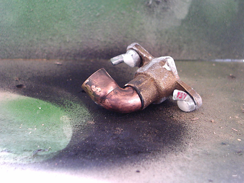
The inlet there was mostly nasty due to having to grind a helmet-fitting curve into the original plumbing hardware I started with:


I found a selection of parts that had a nice look and fit the hose I was using. Used the Dremel to shape them, glued them together with JB Weld, filled in some remaining details with Apoxie Sculpt:


The original intent was to use a separate oxygen mask. As a reminder; the mask started with a duct-tape dummy of my own face, went through plaster positive mold, Sculpey sculpt, pull in PETG, added details in laser-cut acrylic, cast "beads" in acrylic, and plumbing fittings, with the rubber edge achieved by stripping a length of audio cable and slitting the cover to fit it over the edge of the vacuum-formed shell.


But the mask doesn't fit well under the helmet, so we're adding an inlet (that fits the same oxygen hose). The hose itself, by the way, is "universal" washing machine drainage hose spray-painted black then back-painted with grey primer to pick up the details. The coupling at the tank end was hand-fabricated out of ABS plumbing fittings, with tiny strips of styrene glued on to make the finger grips.

Of course, this being actual period Navy gear, we didn't want to take a chance on whatever chemistry was inside the original canisters. So fabricate a new one. Off to the grocery store with a pair of calipers.


Trimmed the can to the right height, fitted an MDF disk to keep it round and make the "top" lid, and filled with a mixture of plaster and crumpled expanded polystyrene (to keep the weight down). Then worked on the distinctive conical ends:


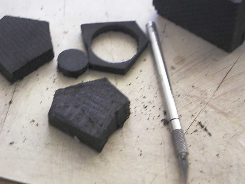
Marked out 1/8" MDF disks;


Cut them out on the scroll saw and glued the stack together. Fitted a short length of ABS pipe in the center and skinned the thing in Bondo. Then the usual round of primer, spot putty, final paint coat to make a vacuum former "buck." I need to find a different paint, though, plus something to use as a proper mold release.

(I would have lasered these out, but it wasn't convenient to run out to TechShop that day).


As usual, the buck didn't survive. But I got two good pulls from it which is all I needed.


Trimmed with metal shears then filled the vacuum formed shells with Bondo and put them on the top and bottom of the can.


When they had hardened, cut a narrow strip of scrap PETG (styrene would work just as well) and used a heat gun to convince it to curve nicely to simulate the metal fold at the top of the can. If I had been smart, I would have sanded it first. As it was, I wrapped tape around the can to protect it while I sanded the PETG down to make it look more like the rolled metal edge at the other end of the can.


And primed, it doesn't look too bad.


The rubber grommets started as a chunk of EVA foam from an old equipment case I had lying around; cut down to 6mm with a razor saw, then carefully cut out into the proper donuts.

All in all, the can is a little too heavy, but it is a decent match for the original, and is sturdy enough to stand being cranked into the pack:


(The insert canister doesn't need the protective end caps...or for the caps to project quite so far into the strong springs of the pack. It won't be getting weathered as these basically come out of the box and get discharged in a couple of hours. The green, however...John Deere green is not a perfect match for the yellow-green of the original equipment, but I'm not going to mix something and try to get a good brush finish so good enough).