This is a rambling set of essays, all right. B.L. Render does a much better job of introducing the concepts of figure creation in small, logical steps in her book "Secrets of Figure Creation with Poser 5." And Doctor Geep has his lovely series of humorously illustrated basic lectures as well.
Be that as it may. Today I'm going to touch lightly on the subject of creating materials -- a subject close to my mind at the moment because I just last night submitted my new prop set for testing at Renderosity.
(As an aside, I'm not happy with them. Oh, they look decent. But I was hoping for a lot more florid detail and random piping and rust and grunge and other deep textures. On the former, I'm just too unimaginative to stick on random gears that don't do anything, and too practical to have spiky bits and wires and glass tubes going everywhere. So they have the solidity of things with an actual design and function...but look a lot less playful and baroque.)
Lecture begins below the fold.
SIMPLE MATERIALS
The simplest material within the Poser universe is just parameter settings; a numeric value, or a color chit. These are often sufficient, especially for smaller parts. Among the advantages are low RAM use (which may mean faster rendering), and easy adjustment down the road.
And of course time saved in painting, collecting, and naming all those texture maps.
Of course, that doesn't mean materials without texture maps have to be simple.
This is the multi-channel procedural shader for the sparkly "Champagne" drum wrap from my previous prop set. No wonder it doesn't render correctly in DAZStudio!
(And this is as nothing compared to bagginsbill and his Matmagica -- which is necessary to achieve truly realistic metals, or worse, the kinds of finishes they put on modern automobiles.)
But we'll talk about procedurals some other time. This session is about texture maps.
TEMPLATES
The first thing you need to paint up a texture map is a guide to where to paint. This is where templates -- more technically termed UV Maps -- come in.
The 3D universe is, well, 3D. Three dimensions. A mesh object sprawls over the X, Y, Z of its particular Cartesian coordinates. It is often possible to texture an object simply using a projection; if the object is a painting hung flat on a wall, you can apply a flat image across X and Z as if it was being sent across space from a slide projector.
If an object is three-dimensional, then it isn't so simple. Enter unwrapping. For each vertex normal defined by those X, Y, Z Cartesians, there can be an associated U, V corresponding to an arbitrary location in UV space.
UVmaps, being the approximation in two dimensions of the surface of an object that exists in three, are always a compromise. It is impossible (for almost all objects) to create a map that is simultaneously free of all distortion, free of seams, and human-readable.
But that, too, is a lecture for another time. Maybe when I talk about mesh modeling for Poser.
Most purchased Poser content will include templates. In the case of DAZ products, for instance, they are an optional download; look for them on the product page.
If you are missing templates, several applications will re-create them. On the Mac the best free option is Steve Cox's UVMapper. It is primitive, but it makes clean maps and I use it all the time.
Carrara, too, will export templates. Check the options of the applications you have available.
If you are lucky, the templates are simple and self-explanatory. Owing to the various compromises that go into UV Mapping a mesh, however, there will almost always be some oddity to how the seams line up, or where things are oriented. You will have to experiment.


In the case of the major DAZ figures (Victoria, Michael, etc.) there are template guides running around that will show how the various seams are supposed to align.
If you are texturing a prop, even your own, you will likely have to do some experimentation to discover just where everything is and what it represents.
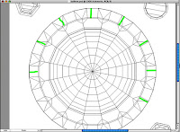
Above, part of my own process; on the left, I switched to wireframe view in Poser, counted polygons, and painted in the green tick-marks you see there in Photoshop. Then I assigned that as a texture map to the surface and adjusted until the tick marks fell properly at the location of the bolts.
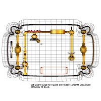
On the right, I used the TOP camera (which is not a perspective camera and thus does not distort) to render the parts of the prop that sit on top of the part I am texture mapping. Then I combined that image with the image in the template. This gave me a guide to where the other stuff connected.
FLOOD FILL
I hate, hate hate hate, the look of flood-filled textures. Particularly if they are otherwise rich in detail. But it is a good place to start. Even if you will be hand-painting (or cloning or collage-ing or otherwise) it is a good backstop to fill the entire texture map with a more-or-less neutral, basic something-or-other.
Among the other reasons; in the preview display mode of Poser, it samples texture maps lightly and extrapolates them. If you cut your texture tight to the edges of the UVs, the preview display will have white lines all over it. And there can be bleed even during some renders. So run all the textures wide by a handful of pixels.
My sources for the base texture are various. I don't care for the texture fill presets in Photoshop, but two of the procedural methods are extremely useful; Add Noise and Clouds.
The simplest brushed-metal texture is to run Add Noise, then apply a Motion Blur to the result.
Nice fractal effects result from running the Clouds render, then using a highly constrained Magic Wand to pick up a hard-edged, jagged pattern from within it. Then create a new layer and fill the selection with a new color.
Enough steps, enough selection tools and distortion filters, and you can get some very deep textures from nothing but simple repetitions of basic procedures.
The other source is of course photographic. There are texture packs available for purchase, and some of them are designated as Merchant Resources; they are provided royalty-free for the purchaser in order to create new content. If you intend to sell your created content, you should be cautious of Google Image searches or any of the various free texture websites out there; not all of them have a clear and defined chain of copyright.
I use almost entirely my own photographs. Whenever I am on vacation, or down to the Hornet Museum or whatever, I tote along a camera and shoot a few frames of things that look useful. In my recent Steamprops set, the chipped yellow paint on the Hydraulic Spanner comes from pictures I took at Deutsches Technikmuseum Berlin of a battered electric locomotive.
The galvanized metal texture comes from part of an old Archer project box I stuck on top of my flatbed scanner some years back. I've also scanned bits of fabric, the wood sample chips from stain companies, and even the heavy steel baseplate from a microphone stand!
As with sound design, the trick is to divorce "what it was" from "what it looks like." The nubby paint texture on that same wrench comes from a piece of strange-looking brown fabric I scanned.
In all of these, you will be doing all sorts of tweaking with level and color tools in your paint software. And probably more than a little stretching, distortion, and hiding seams and blemishes.
TILING
In most 3d objects, there will be seams in the maps. There are only two objects that get away from this rule; clothing, and origami. These are the only things in the 3d universe in which the surfaces actually are flat, and the seams are there in the real thing.
In something as simple as a cube, although one might assume the whole thing was carved from a single block of material, in the texture map there are a minimum of three seams.
(Okay; actually, you could stretch the map to close off at least one of these, but that just trades one problem for another!)
Since I don't own Bodypaint or another application that allows me to paint in 3D space, I fix these problems in 2D. For this last prop set, I had one networked computer running PhotoShop and the other running Poser. I'd paint a little, save the PhotoShop working file, the networked machine would pick up the changed texture map and do a test render of the results.
For most of the seams, I copied a strip of one edge, made it another layer and locked it. Then I painted on the master layer until it visually matched up.
Another old trick for tiling is to use the Offset command (you can do this manually by Nudging the working layer, copying it, and moving the copy until it butts up cleanly). When you Offset, you move a part of the texture that already matches perfectly across the seam. Then you fix the new seam you've moved into the center of the workspace.
I'd illustrate this but it is hard to show as a screen shot.
DISTRESSING
 For even a super-clean looking prop, it helps realism immensely to
 put a little darkening into the nooks and crannies.
There are two reasons this happens in the real world. One is that grime does collect, and surfaces that are indented receive less wear. The burnishing effect of handling tends to lighten the appearance (via increased specularity among other effects). And although 3D render engines attempt interobject reflection, they are rarely able to apply it properly across very small areas.
So you paint a little darker in the cracks. This is what people do
for real, physical props. Even make-up, on the stage and film actor, is a similar enhancement of the natural existing planes and edges. Film, like the flat lighting world of the big stage, and like, of course, the artificial world of 3D, benefits from this sort of enhancement.

So the first pass is probably a Grime Map.
This one's from a slightly dirtier prop. Using the template as a guide, I applied soft brush, airbrush, and a little judicious Gaussian Blur on the results in order to darken the joins and cracks of the various bits of brass piping on the prop.
Actually, I painted in a sort of dirty-brown, on a layer set to Multiply. As with all of the illustrations here this has been modified somewhat for clarity.
For me, the rubbing down of high-wear surfaces is usually a second layer. Often I use one of PhotoShop's Adjustment Layers for this.
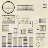
In the comp to the left, the template are is filled with a photographed wood texture. Then a large rectangle was drawn in representing the areas receiving the most handling/wear. Gaussian Blur was applied to that rectangle, and the resulting map plugged into an Adjustment Layer.
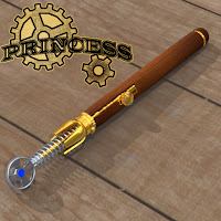
The result is visible on the thumbnail image of the prop a few pictures above.
For a clean (or simple) surface there might just be a quick-and-dirty pass for the grime layer. For other surfaces, you might have a few additional layers for chips, scratches, grease stains....
And of course, there may be details that are painted onto the map and not a part of the mesh. Actually, there are likely to be a lot of those sort of details. They might be as relatively simple as the lettering on a dial. They might be photo-real depictions of additional screw heads and so forth. This is the sort of thing that makes painting up texture maps fun.
SURFACE EFFECTS
Sometimes you can plug the same map into multiple channels (particularly if you are willing to play with shader nodes a little to adjust it).
At the last minute, I decided the handle of the magnifier prop didn't quite work as Amber or Shellac, and I changed it to Gutta-Percha by plugging the texture map into a base color. I could have also run it through an HSV shader node -- but doing it this way enhaces DAZStudio compatibility.
(The best compatibility is to make the fix in PhotoShop, and thus "bake" the node adjustments you might have made into the texture map itself.)
The most common additional texture maps (on top of the Diffuse Color), are Bump Map, Transparency Map, and Reflection Map.
In previous products I used a distinctive name scheme; "shellWood.jpg", "shellWoodBUM.jpg", "hairBangsTRANS.jpg", and so on.
You can of course also have maps for specularity, or any of the value channels. Useful effects are achieved by plugging color information into the Diffuse Color channel, but having the luminosity controlled by a different (and grayscale) map plugged into the Diffuse Value channel.
When you want stuff to stick out, use a Displacement channel instead of a bump. Bump is a render effect that adds additional shading as if the surface normals were at an angle. Displacement is a micro-poly render-time effect that dynamically subdivides the mesh and selectively extrudes parts of it along the surface normals. You can see the difference at an edge. A bump map looks similar at the center of an object, but compared with the results of Displacement, the edge of the object is unchanged.
Even better than either of these for some situations is the normals map. This simulates a change in the coordinates of the surface normal, and thus is capable of undercuts in a way that no displacement map can match. But creating (and using) normal maps is a subject for another post!
Every additional map can enhance the detail (and presumably realism) of the final effect. But each additional map is additional work, additional RAM during render, more chances to lose track of a file or get a name or reference wrong. So you pick your battles. Sometimes a simple color chip is all a surface needs.
Other times, you have a few more...
Transmap on the glass, bump map on the glass, grime map on the glass, reflections on the glass, tex map on the gauge face and pointer. Color tex on the brass, also a reflection value map for the spots where the reflection channel (and background reflection map) is allowed to work.
And, yes, there's texture stretching, pixellation, and visible seams here. But this is a much closer render than the object is intended for.


No comments:
Post a Comment