The rest is below the fold because this is a long post.
Concept:
AT THE TIME, I had been looking at a lot of sample books in the thriller range, books which tended towards a title that combined a recognizable historical reference with the name of a document; The Magdalene Referendum or The Galileo Index or The Tamerlane Manga. Or a historical or place name followed by an ominous action verb.
My working title at that point was The Enceladus Calyx (to be followed by The Aurelius Dupondius and The Takarazuka Gumpai.) So, yeah, not exactly on format. It did stay in the manuscript in the form of the artifact itself, which is identified in-world as a calyx krater.
And that's when I came up with the cover idea of a period artifact that would have an image relating to the modern events. I'd do the same thing for the coin at the center of the next adventure:

Well, when I had the book finished, it fit a little closer with the "cozies" than it did the "general category" thrillers. The cozies have less action, more mystery and suspense, less gunfights and other red-blooded heroism and more realistic and uncomfortable violence. And are built around a quirky, often female, central character. (The straight thrillers have personalities at the center, too, but it is more like this particular ex-SEAL likes warm beer and listens to jazz.) The cozies have, well, quirky titles.
So that's when I switched to "Fox" themed titles. They coded better for the market. Which orphaned the cover design a bit. And I may seem like I am hammering on this but the industry standard advice is to make your cover look as much as possible like everyone else's. That is how to get the eyeballs that will hopefully translate into sales. In that, I failed. I had the one idea and I was going to stick with it even though it was not a good design in the larger scheme of things.
(More-or-less, the larger-stakes, guns-blazing thriller side may have an artifact and will have dramatic lighting with glows and gradients and so forth. The solo-heroine stuff tends towards a girl from a stock picture and an indistinct background. Then there's a weird break where some go over to the cozy side with collage and finger-painting and various other odd designs.)
There are many tutorials out there on how to use PhotoShop to detach your ImageStock brunette of the day from her background and slap in bits of a brooding city scape or hanging vines or just random clouds and lightning flashes. This isn't one. The rest of this essay is mostly about how to assemble a cover using slightly less, well, stock elements.
And here's the mock-up I did to proof the concept:

(Obviously back before I changed the name.)

Data:
THE FIRST QUESTION IS, how big is a cover? Fortunately there are resources out there. There are a range of sizes accepted at the various eBook markets but the recommendation is a 1.6 : 1 ratio, with the long side 2500 pixels or better. Amazon's KDP (Kindle Direct Publishing) won't accept less than 1,000 pixels in the smallest dimension.
Since Gimp crops to the canvas after certain operations, I made an oversized canvas and created a white frame as the top layer; that would define my visible image. When it was all done I trimmed to size.
Paperbacks are a little more complicated as you need to know how wide the spine will be. And as it turns out Amazon will calculate that for you, based on your uploaded PDF and your paper choice, and hand you a color-coded PDF that shows not only the recommended pixel size and exact dimensions, but bleed areas and where the Amazon-supplied bar code will go.
Assemblage:
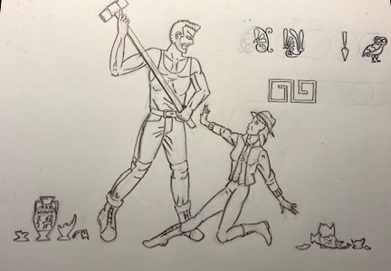
A CENTRAL MOTIF in the story is the battle between the Goddess Athena and the Giant Enceladus, part of the Gigantomachy. The once-titular Enceladus Calyx, in-story, depicts this moment:

(This is a later, red-figure plate; but it is noted in-story that this had yet to become a motif in Greek art at the time my fictional calyx was painted). In the story, the calyx was found in pieces and the fragment containing Athena ended up in a dig in Germany (long story -- in fact, read the story, then you'll understand!)
Athena is a phantom figure throughout the book, possibly behind the scenes pulling strings -- my protagonist thinks so at one point, but she's a little delirious at the time. And during the events of the climax my protagonist, not so coincidentally also calling herself Athena, has to try to fight a really, really big guy she promptly dubs "Encie." It was obvious even to her.
The first thing, of course, is to build the pot itself:

This was built in Cheetah3D. No time for a whole lecture on 3d, but the body of the pot is a Spline object -- a Bezier curve defined by a small number of control points -- that is swept with a Lathe operation.
(There's about four major forms of krater. The basic krater -- like all of the form used for mixing water and wine which means they were often at the center of a symposium and painted up quite fancy. The column krater, where the handles are joined to the rim, the volute krater, where they are fancy spirals sticking above the rim, and the calyx krater, where the mouth flares out like the calyx of a flower. There are easy to find sources of the various shapes, but I just did it by eye.)
My first version of the handles I didn't like, so I constructed new ones using box modeling and subdivision to smooth them. And mirroring to make them into complete and matching handles.
Cheetah3D generates decent UV maps; I slapped on a checkerboard pattern and viewed it within Cheetah and it was good enough to use.

THE UV MAP IS the way a 2d image is attached or wrapped or otherwise projected onto the 3D surface. Of course there needs to be an image:

After several false starts and a lot of help from my light box and my artist's mannequin I got the final version started. It is impossible to see in the progress shots I snapped with a cell phone, but the first part of the figure drawing is action lines; big sweeping curves in red pencil that define important ideas about the pose (like where the weight is, where the thrust of the force is going, etc.)
Then anatomical masses are roughed out in blue pencil. I was feeling challenged enough I went and drew heads (circles from a template) to see if the proportions were falling sort of in the right places. And then the rest of the anatomy is worked up with a harder lead that leaves as little on the paper as possible (another reason why it is hard to record).
Costumes, features, details, and a very small amount of "Greekification" was next, and when everything was in the pencils, inked in with brush. The biggest problem at this point was actually guessing how much detail would "read" in the final image. I didn't want to get too fine with the linework, despite the actual red-figure pots being fine indeed, because I didn't want it to get lost in the final paste-up.
So the really nice drapery and fabric patterns, not so much. The profile heads, the nearly frontal torsos, the positioning of the limbs all inherit from the model (the black-figure period, particularly, it was almost impossible to clearly overlap figures or parts, so they tended to be drawn quite "open.")
Oh, yeah, and also scribbled up some motifs, again doing them by eye from various references I found.
After a bunch of comping and some thirty layers in Gimp the final color map came together. There was quite a bit of back-and-forth between Gimp and the software render, making sure everything fit properly. Along those various steps I pre-distorted the art to better fit the distortions of the UV mapping.

THEN INTO Poser 11, my chosen render engine for this project. A day or two there of tweaking textures and materials and doing test renders. Out of Gimp I also generated a bump map, a specularity map, and a displacement map; the last is because Poser 11 will do micro-poly displacement, meaning you can add something like the crack in the pot in a way that it will actually change the surface (instead of, as with a bump map, merely looking like it changes the surface).
That all got saved as the final textured pot.
At some point I stopped off and picked up a free ground texture which also had a displacement map, and modeled a rifle bullet. The bullets were literally dropped into the image; I cloned a dozen of them, stuck them in the air, enabled physics and ran a hundred-frame animation to let them fall into a heap on their own.
The big problem I had was Poser 11 has changed how it handles spherical maps. I was unable to properly map the reflection map/HDRI map I had created for more realistic lighting and reflections. But without reflection the bullets looked ghastly.
Another new peculiarity is that Poser 11 won't render volumetric lighting if there isn't a backdrop. Very odd. Works if the backdrop is black and set to invisible; it just has to be there. I look forward to when that software gets better documentation.
RENDERING IN 3D takes a while, especially lighting effects. So don't get caught into trying to tweak everything in the render. Render multiple layers and tweak in the comp. So I rendered scene, effects lights, light shaft, and reflections as different documents.
Comp.
FONTS ARE A BIG SUBJECT. I found a neat little resource that piled up a bunch of the most-used fonts by genre (you can find it via this friendly web page):

I never found the perfect one, but "Archaeologicaps" has a stark, nearly sans-serif look to it which fits in with the thriller look. I tried out a Dionysus but it was a little too cutesy. The rest is in simple Helvetica or the nearest substitute (you don't want to do the full cover in a decorative font. Gets cluttered and hard to read).
SO ONCE AGAIN into Gimp for another thirty-layer document. This time it is adjusted clones, particularly of the light shaft. A somewhat late change was to color-shift the pot and the lettering into the orange and contrast the light shaft and side lighting as teal (a very typical color scheme). The light shaft was always designed to be comped in as a "screen" layer that lightens what is below it, and carefully chopped so it doesn't lighten the pot itself too much in the process.
This, in fact, is the part most of those tutorials would go into; tweaking colors, creating gradients (be subtle with them!) and carefully cutting out parts of images.
The biggest image edit I made -- and I had been expecting to make it when I rendered -- was that the bullets were too far away and needed to be dragged closer to the pot. Unfortunately I didn't have a render of just bullets on black background but it wasn't too onerous to do it anyhow.
AND...THAT'S IT.
(The owls were done by printing out a photograph of a stone fragment from the Acropolis, light-boxing it to trace it in pencil, painting with a brush, scanning and cleaning it up in the software paint program.)
No comments:
Post a Comment